10-year Rebrand of a Local Business
10-year Rebrand of a Local Business
10-year Rebrand of a Local Business
Refining the look of Artisan Windows & Doors
Refining the look of Artisan Windows & Doors
Refining the look of Artisan Windows & Doors
Freelance
Freelance
Freelance
8 months
8 months
8 months
January 2024
January 2024
January 2024
Designer
Designer
Designer
CONTEXT
CONTEXT
CONTEXT
Time for a Refresh!
Time for a Refresh!
Time for a Refresh!
Artisan Windows & Doors is a local retailer of luxury windows, doors, and hardware in San Luis Obispo County providing the highest quality products and customer service to the Central Coast.
As Artisan surpassed their 10-year business anniversary, it became apparent that they needed to broaden and improve their digital presence. The client came to me with a need for a radical transformation to refresh their brand and gain client traction.
PROBLEM
PROBLEM
PROBLEM
Defining the Company’s Brand Vision
Defining the Company’s Brand Vision
Defining the Company’s Brand Vision
Artisan's branding and website presented the following key areas for improvement:
Artisan's branding and website presented the following key areas for improvement:
Artisan's branding and website presented the following key areas for improvement:
Outdated Branding — The visual identity no longer reflected the company’s evolution. A refined, sophisticated, and professional look was desired to align with Artisan's growth and position in the luxury market.
Outdated Branding
The branding needed a refresh to reflect the growth of the company. An image of sophistication, luxury, and professionalism was desired.
Content Overflow — The website lacked clarity and focus, overwhelming users with information while leaving key details, such as vendor partnerships, unclear or missing.
Content Overflow
The website lacked conciseness and clarity. Products can be viewed but information about vendors is not provided.
Limited Client Source — Relying primarily on referrals and existing relationships, client acquisition remained narrow. Expanding into the digital space opens the door to broader reach and new business opportunities.
Limited Client Source
Clients are sourced through existing relationships and referrals. Entering the digital world will drive new business and present more opportunities.
CHALLENGE
CHALLENGE
CHALLENGE
Develop a refined brand identity and digital presence that elevate the company’s image and support its continued growth in a competitive market.
Develop a refined brand identity and digital presence that elevate the company’s image and support its continued growth in a competitive market.
Develop a refined brand identity and digital presence that elevate the company’s image and support its continued growth in a competitive market.
BRAND
BRAND
BRAND
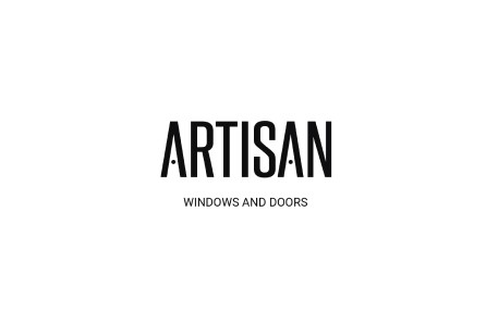
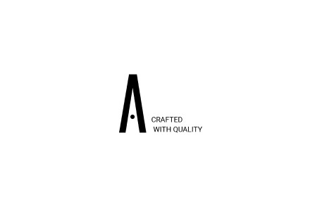
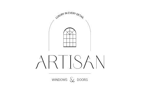
Crafting the Visual Identity
Crafting the Visual Identity
The client sought a logo that communicates luxury. Drawing inspiration from serif typography, I designed a custom typeface that balances modernity with sophistication. The new logo subtly integrates a ‘window’ motif into the door knob of the letter ‘A,’ which also serves as a standalone logomark, per the client’s request.
The client sought a logo that communicates luxury. Drawing inspiration from serif typography, I designed a custom typeface that balances modernity with sophistication. The new logo subtly integrates a ‘window’ motif into the door knob of the letter ‘A,’ which also serves as a standalone logomark, per the client’s request.
The client sought a logo that communicates luxury. Drawing inspiration from serif typography, I designed a custom typeface that balances modernity with sophistication. The new logo subtly integrates a ‘window’ motif into the door knob of the letter ‘A,’ which also serves as a standalone logomark, per the client’s request.
Spin to see the proposed logo ideas!
Spin to see the proposed logo ideas!
Spin to see the proposed logo ideas!


Spin to see the final color palette!
Spin to see the final color palette!
Spin to see the final color palette!


Spin to see the final logo suite!
Spin to see the final logo suite!
Spin to see the final logo suite!


WEBSITE
WEBSITE
WEBSITE
A Renewed Digital Experience
A Renewed Digital Experience
A Renewed Digital Experience
Crafted for loyal clients, built to attract new ones

Landing Page | Before
Landing Page | Before
Landing Page | Before

Landing Page | After
Landing Page | After
Landing Page | After
Landing Page | Mobile Version
Landing Page | Mobile Version
Landing Page | Mobile Version
Thought Process
Thought Process
Thought Process
As discussed with the clients, the website was updated to reflect a modern, professional look aligned with the new branding, featuring a clear content hierarchy, simplified navigation, responsive design across all devices, and scroll-activated content sections for improved readability.
As discussed with the clients, the website was updated to reflect a modern, professional look aligned with the new branding, featuring a clear content hierarchy, simplified navigation, responsive design across all devices, and scroll-activated content sections for improved readability.
As discussed with the clients, the website was updated to reflect a modern, professional look aligned with the new branding, featuring a clear content hierarchy, simplified navigation, responsive design across all devices, and scroll-activated content sections for improved readability.
Key Update
Key Update
Key Update
Mobile-friendly Version — The site is now fully responsive, allowing both new and returning clients to easily access and navigate it across all devices.
Mobile-friendly Version
The site is now fully responsive, allowing both new and returning clients to easily access and navigate it across all devices.
Mobile-friendly Version — The site is now fully responsive, allowing both new and returning clients to easily access and navigate it across all devices.
Product Page | Before
Product Page | Before
Product Page | Before
Product Page | After
Product Page | After
Product Page | After
Thought Process
Thought Process
Thought Process
The site is designed for quick access to service and vendor information for both new and returning clients. Clear category descriptions, improved thumbnails, and enhanced vendor galleries with slideshow views and direct links streamline the user experience.
The site is designed for quick access to service and vendor information for both new and returning clients. Clear category descriptions, improved thumbnails, and enhanced vendor galleries with slideshow views and direct links streamline the user experience.
Key Update
Key Update
Key Update
Product Tab for Vendor Info — Provides users with quick, streamlined access to vendor details and the products they offer.
Product Tab for Vendor Info
Provides users with quick, streamlined access to vendor details and the products they offer.
Contact Page | Before
Contact Page | Before
Contact Page | Before
Contact Page | After
Contact Page | After
Contact Page | After
Thought Process
Thought Process
Thought Process
The website's primary goal is to attract new business, starting with the "Contact Us" button. The updated contact page features visuals, a live office map, and a form that captures project needs and client availability.
The website's primary goal is to attract new business, starting with the "Contact Us" button. The updated contact page features visuals, a live office map, and a form that captures project needs and client availability.
Key Update
Key Update
Key Update
Contact Page — Quick access for prospective clients to connect with the business and kick off a new project.
Contact Page
Quick access for prospective clients to connect with the business and kick off a new project.
Contact Page — Quick access for prospective clients to connect with the business and kick off a new project.
RESULTS
RESULTS
RESULTS
Client Testimonial
Client Testimonial
Client Testimonial
"Jae Conine is simply amazing! Our website and branding have never looked better, and we're so happy! They were the driving force behind our 10-year rebranding journey at Artisan Architectural Products, and we couldn't be happier with the results.
"Jae Conine is simply amazing! Our website and branding have never looked better, and we're so happy! They were the driving force behind our 10-year rebranding journey at Artisan Architectural Products, and we couldn't be happier with the results.
Jae's professionalism is outstanding, and their communication skills are excellent. Not to mention, their eye for aesthetics are simply fantastic. Their organizational skills made navigating the project a piece of cake, and they always kept us ahead of the curve with their innovative designs.
Jae's professionalism is outstanding, and their communication skills are excellent. Not to mention, their eye for aesthetics are simply fantastic. Their organizational skills made navigating the project a piece of cake, and they always kept us ahead of the curve with their innovative designs.
If you're looking for someone who is dedicated, talented, and will elevate your brand to new heights, look no further than Jae Conine. Working with them was an absolute pleasure, and we highly recommend their services!"
If you're looking for someone who is dedicated, talented, and will elevate your brand to new heights, look no further than Jae Conine. Working with them was an absolute pleasure, and we highly recommend their services!"
Daniel Bateman, Executive Director of Artisan Architectural Products
www.artisanwd.com
Daniel Bateman, Executive Director of Artisan Architectural Products
www.artisanwd.com
Check out the brand gallery below!


Let's connect!
Let's connect!
Let's connect!
Let's connect!
Get in touch for opportunities or just to say hi 👋
Get in touch for opportunities or just to say hi 👋
It all starts with an idea💡
Designed and Illustrated by Jae Conine.
Copyright © 2025 Jae Conine. All rights reserved.
It all starts with an idea💡
Designed and Illustrated by Jae Conine.
Copyright © 2025 Jae Conine. All rights reserved.